Meaning in Flux
2017 Identity
Meaning in Flux is a semi-regular conference on semantic shift hosted by Yale University's Brain and Language Lab.
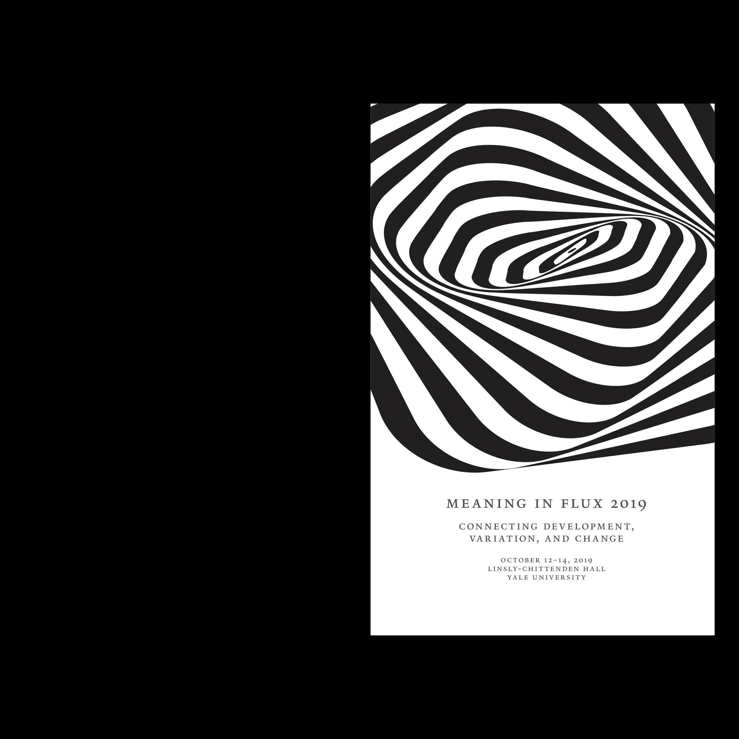
I created a mark for the conference with the aims of capturing the nature of linguistic flux, The final design draws inspiration from Franco Grignani's black-and-white illustrations of ribbons in motion. This mark, however consists of concentric circles, that have been gradually distorted into a spiral-like shape, representing not only flux and fluctuation, but also the constraints within which those changes are allowed to happen.
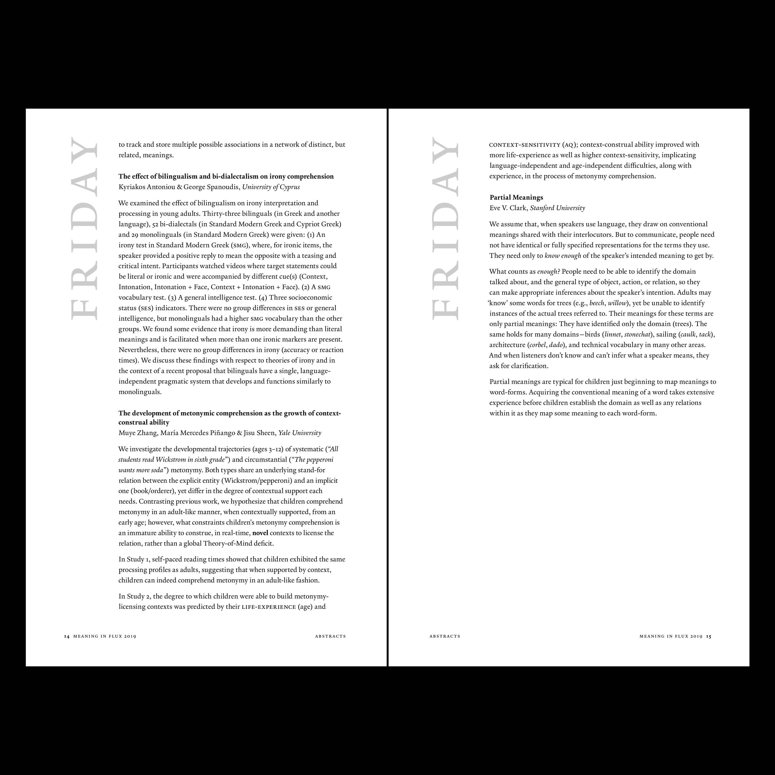
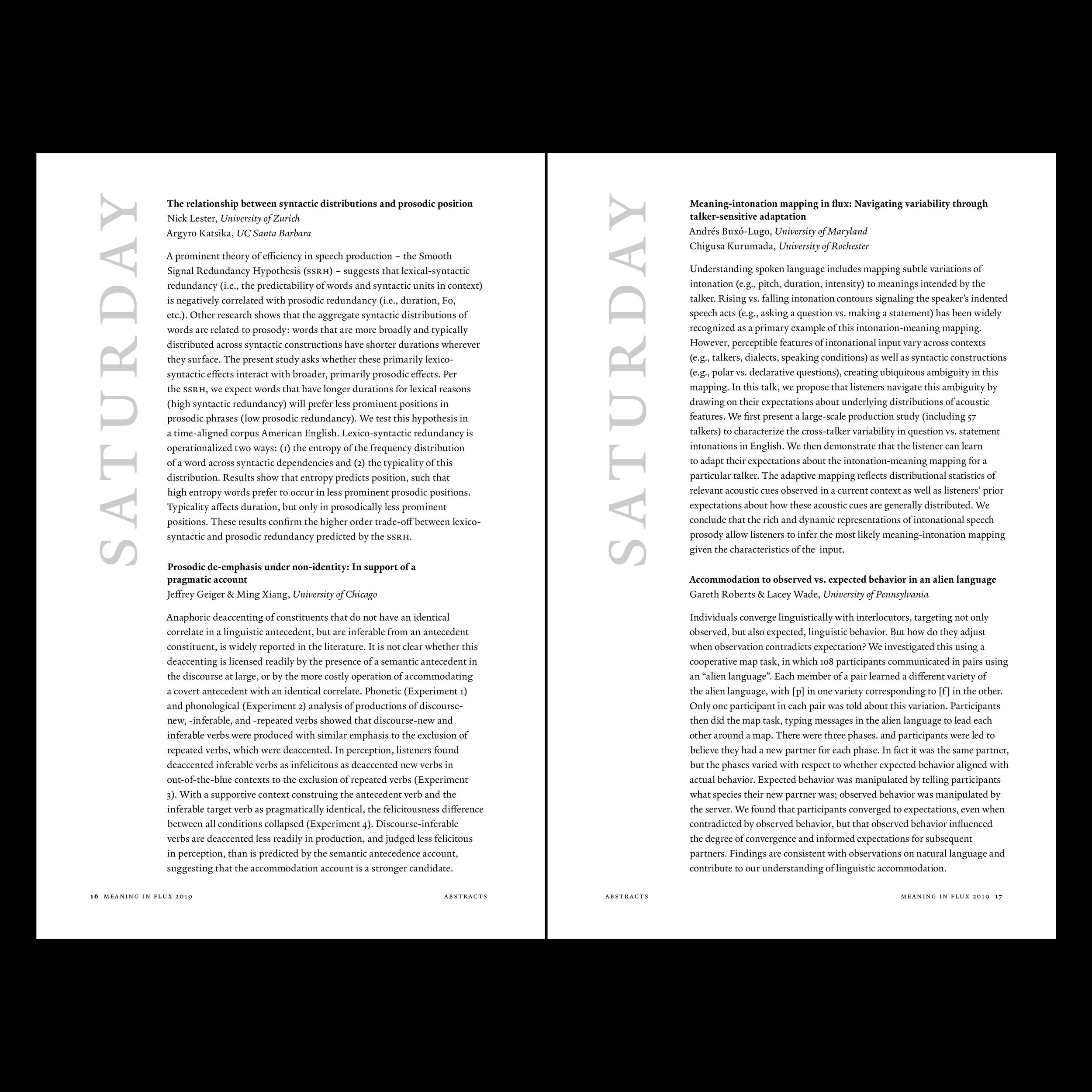
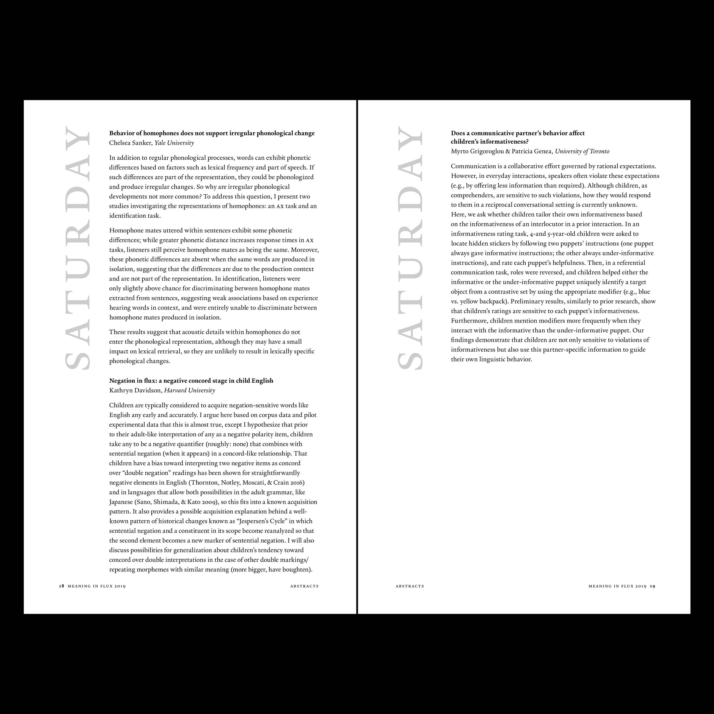
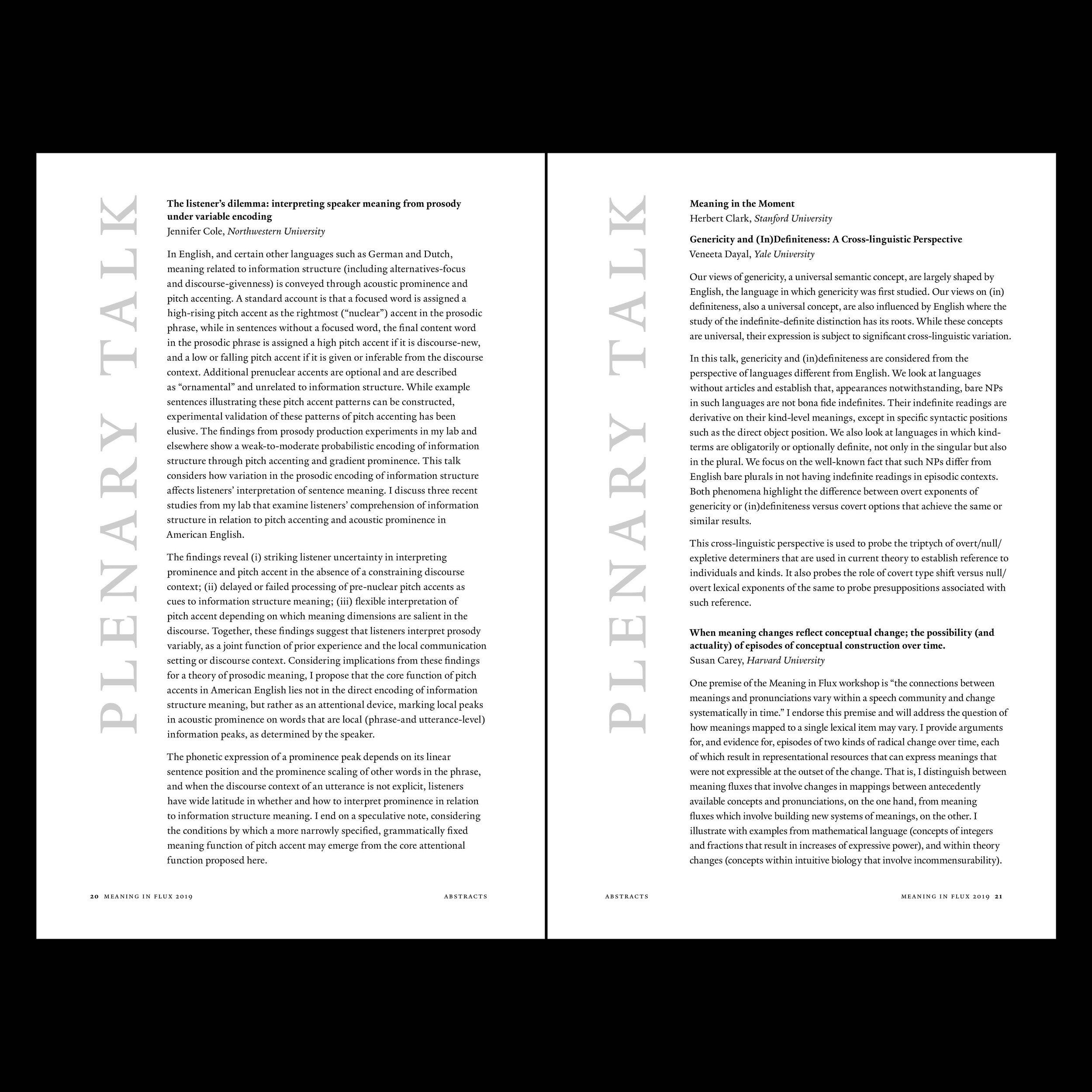
The primary typeface in the poster design is Yale's proprietary typeface—designed by Yale School of Art faculty member Matthew Carter—which incorporates in its design many of the formal characteristics of the old-style typefaces used in Yale publications since the 18th century.

Meaning in Flux 2017
distorted spiral consisting of concentric circles

2019 Identity

Meaning in Flux 2019
Updated mark, again hinting at the simultaneous mutability and constancy of language
The Event Poster
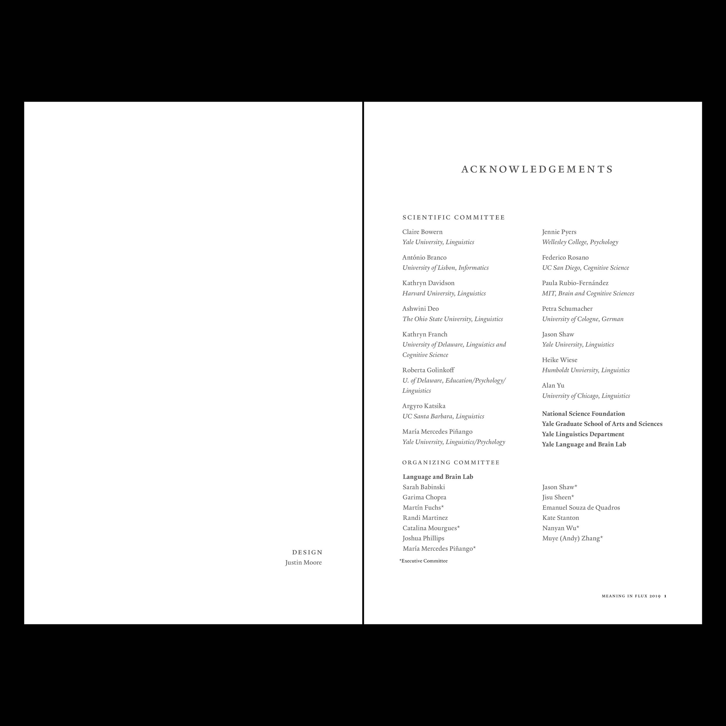
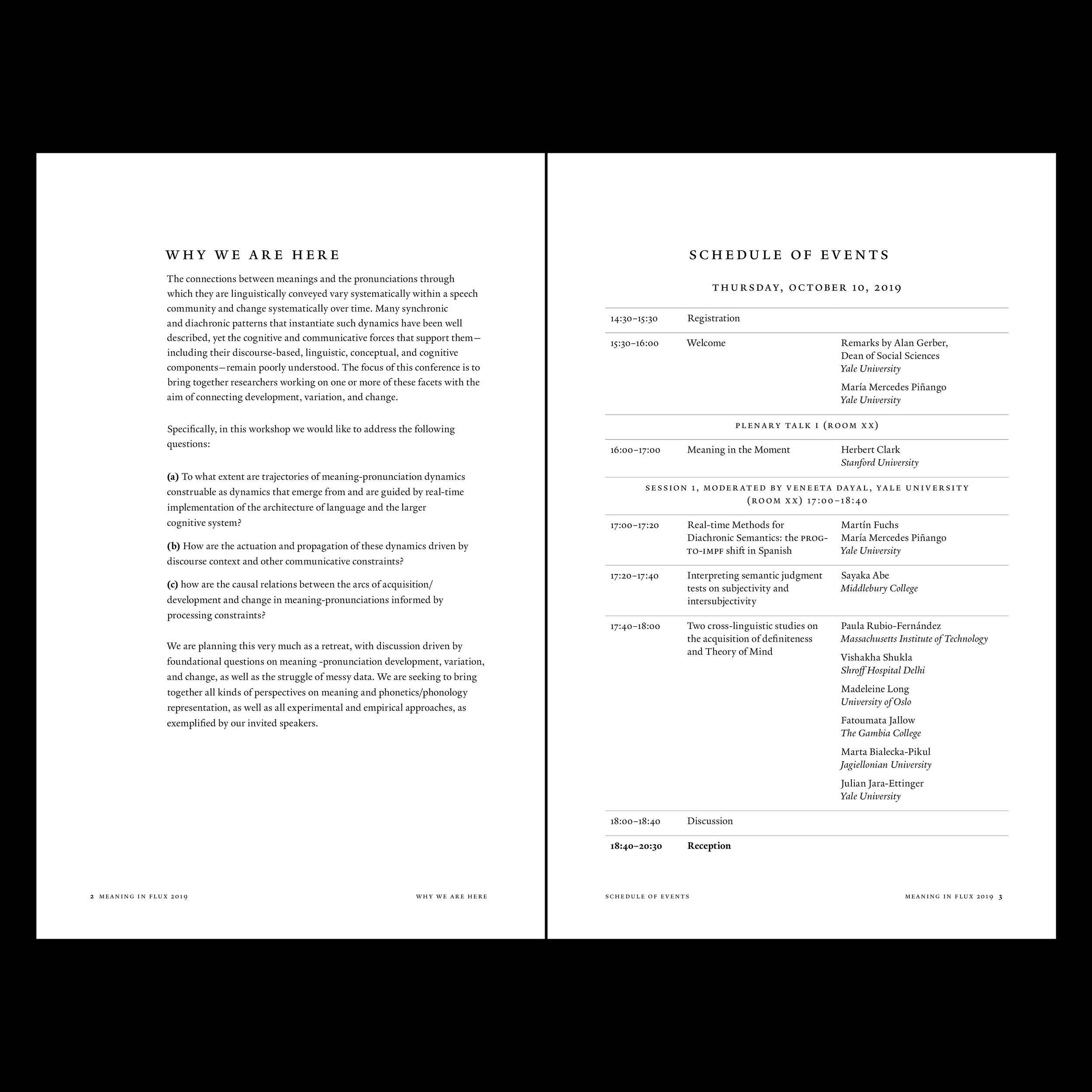
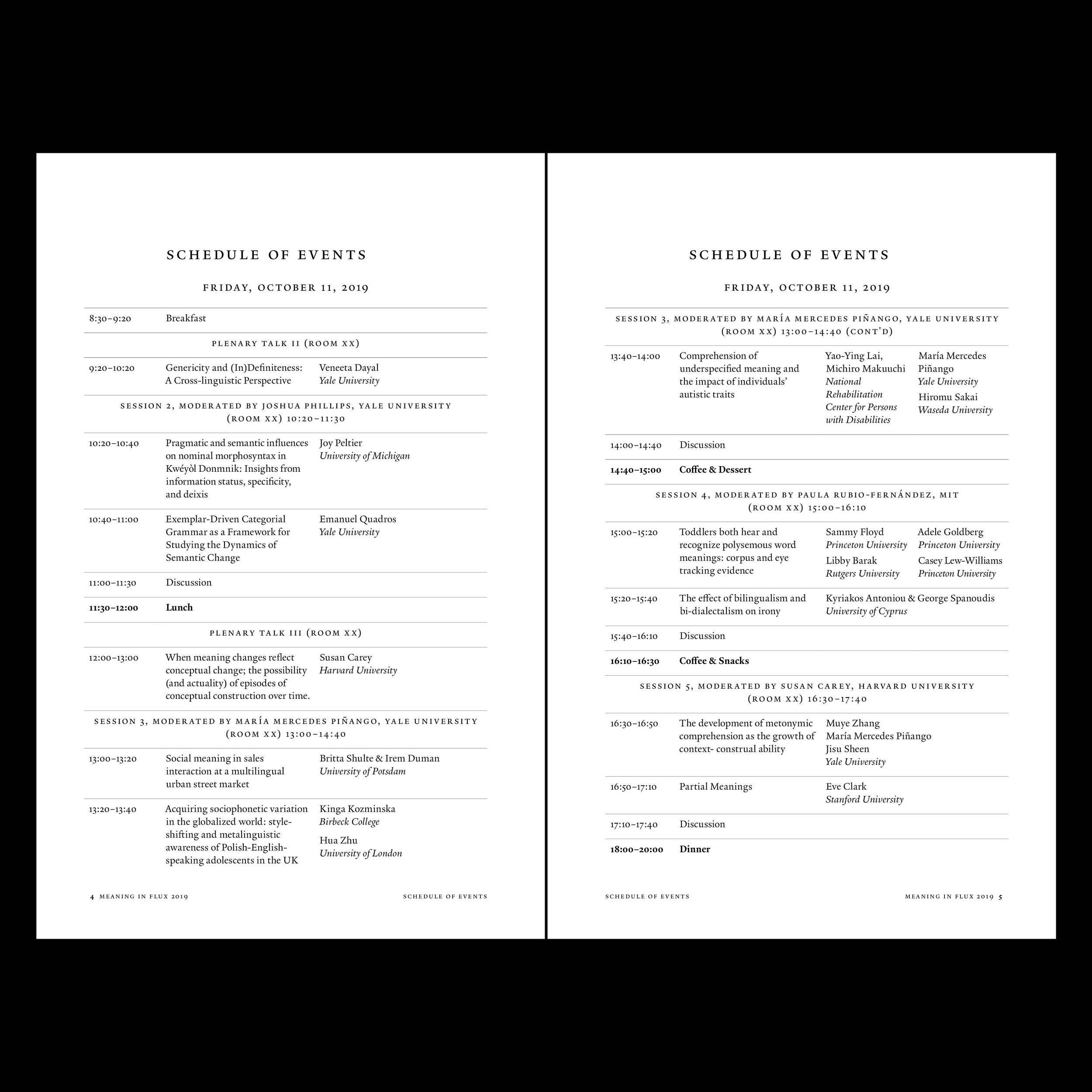
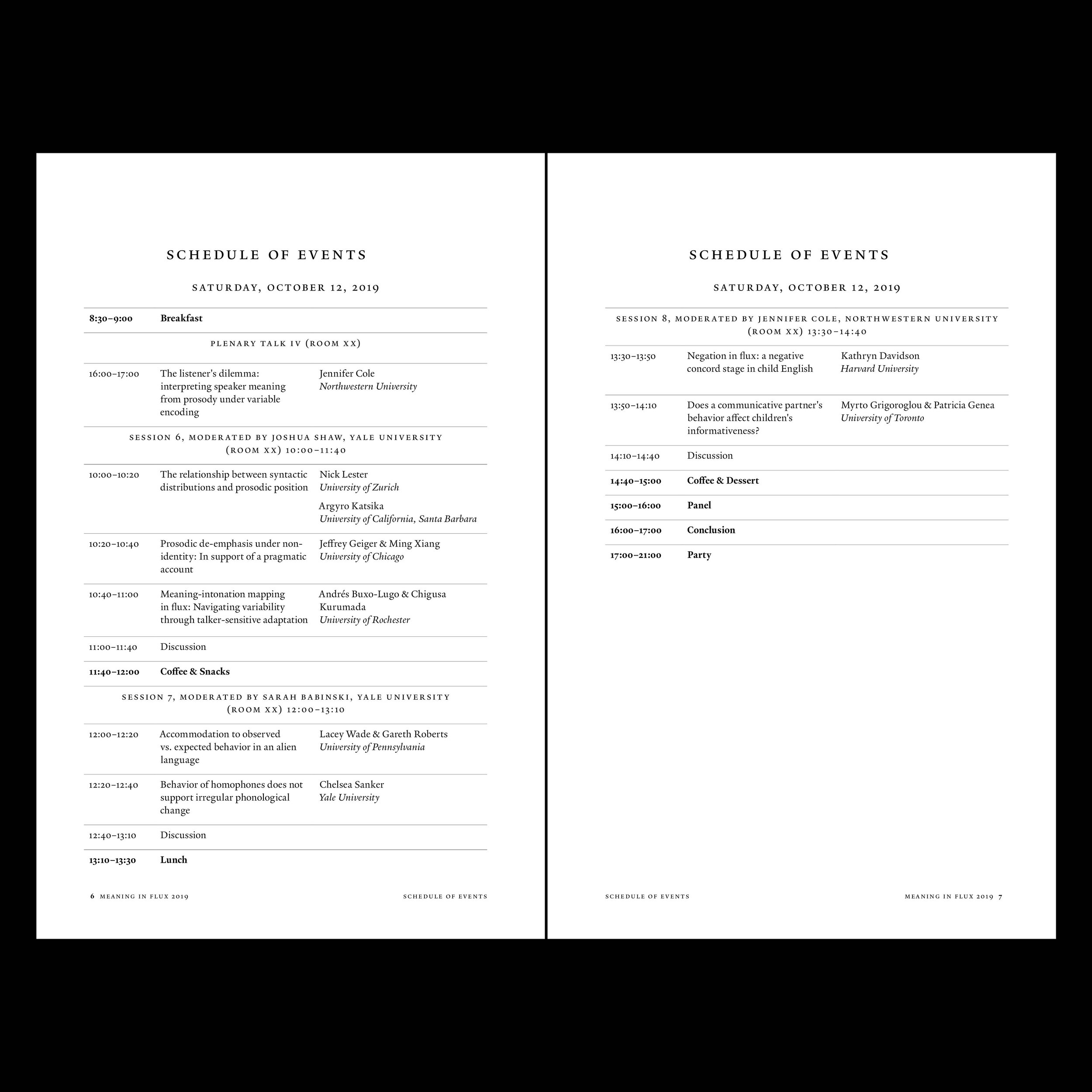
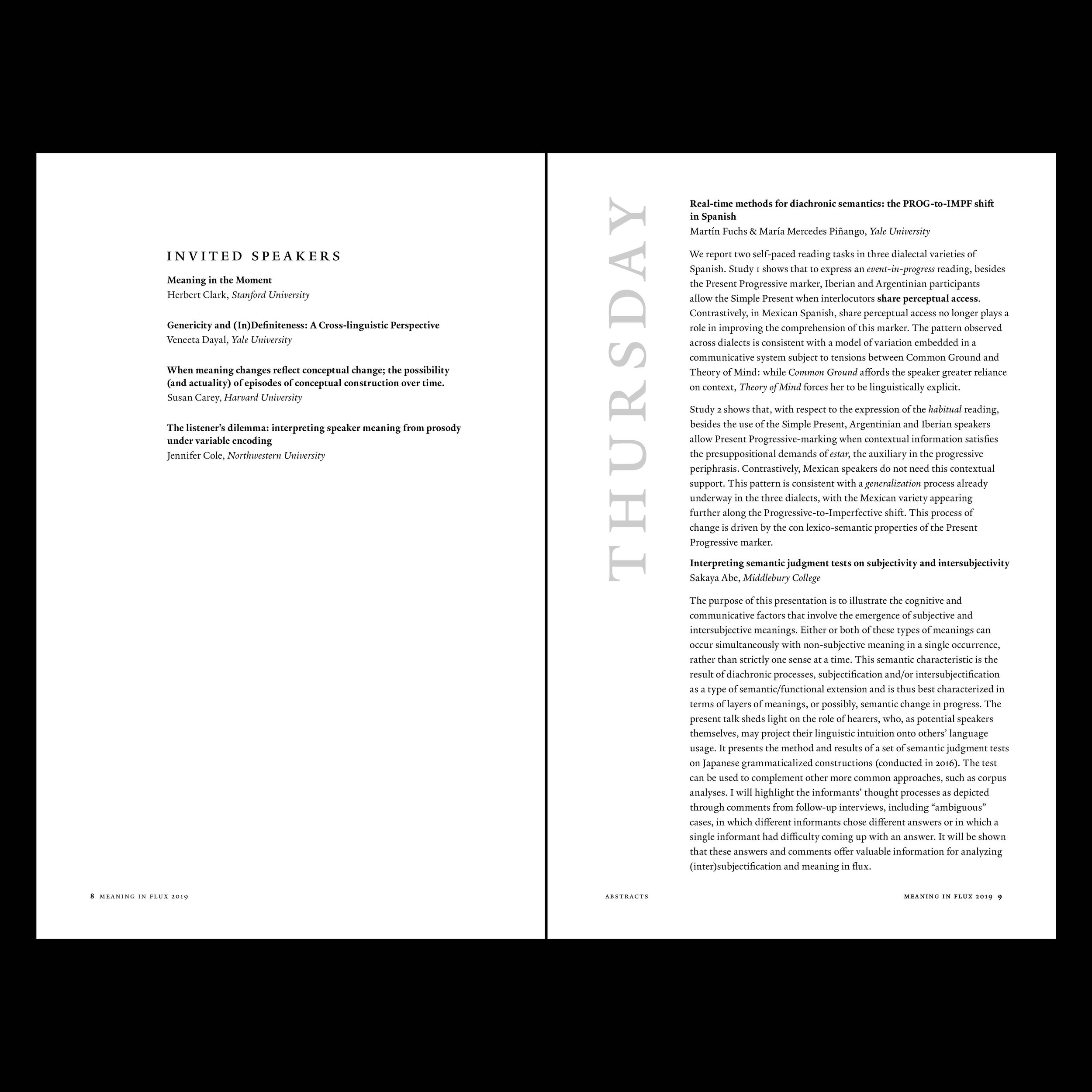
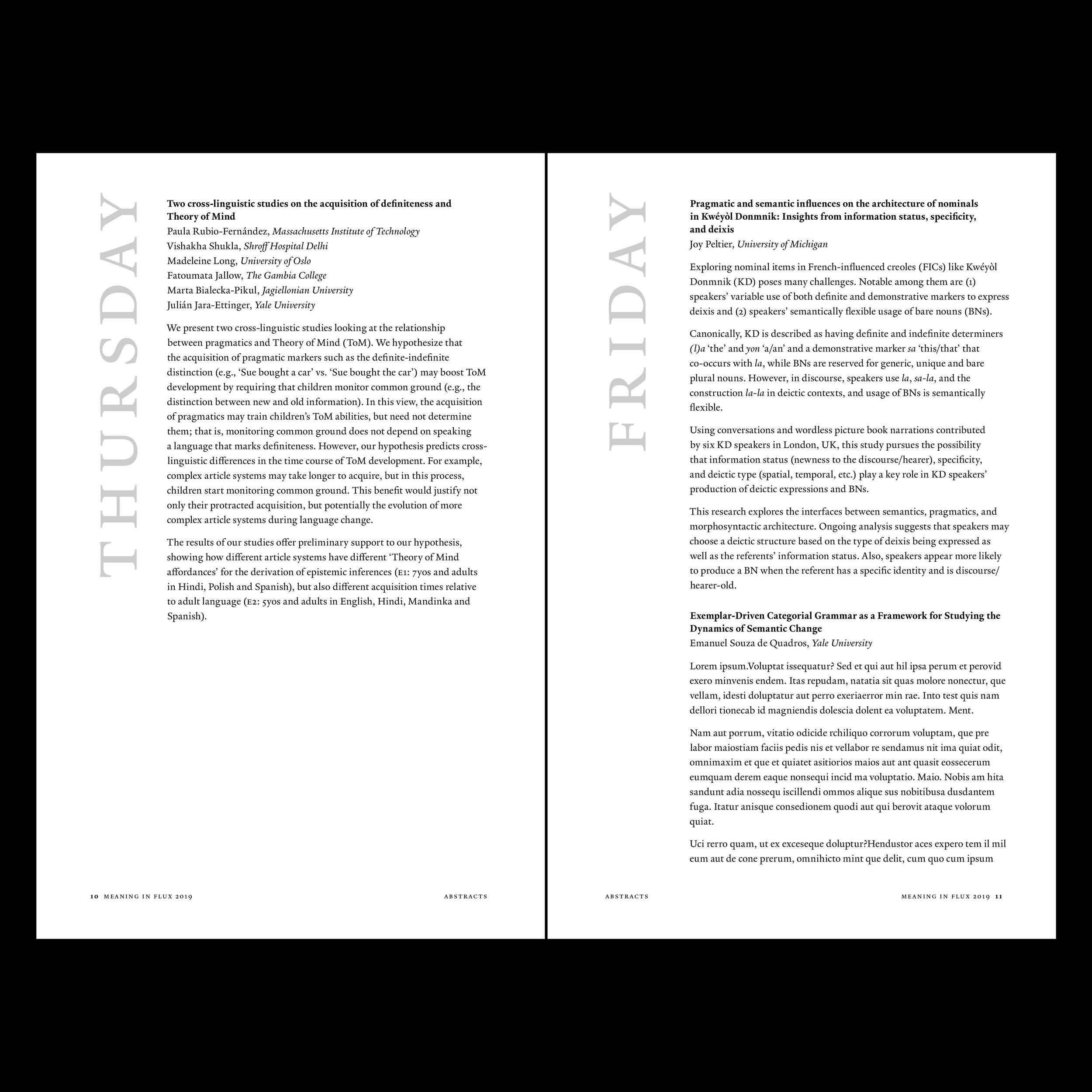
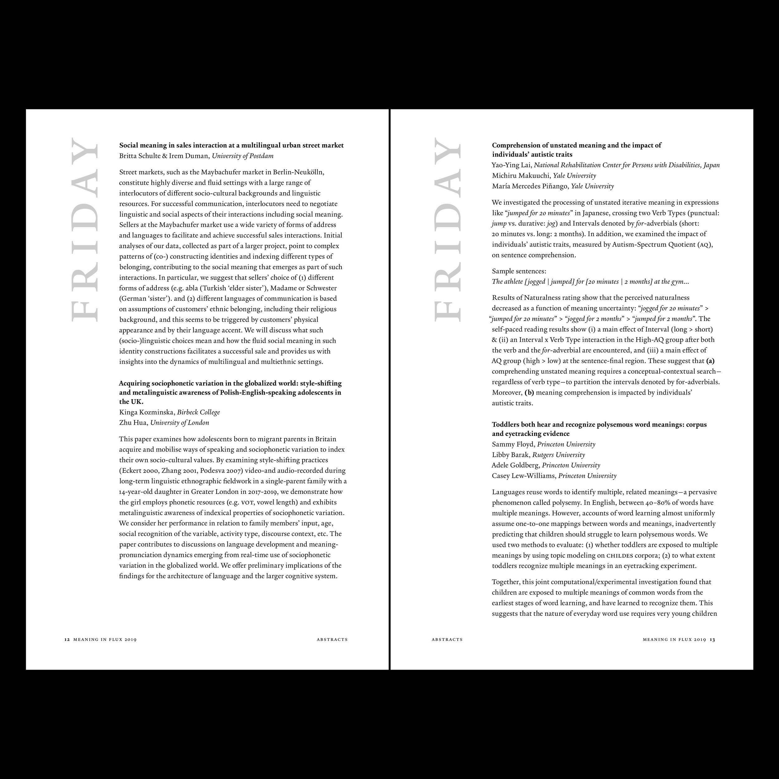
The Schedule of Events