
Circumference Magazine Redesign
Circumference, a biannual magazine of translation and international culture, began in 2003. The editors published seven issues over five years, at which point management switched hands, and these editors continued to publish online. As the editors made the move to start their own imprint, Circumference Books, Circumference stopped publishing as of June 2017. However, with the help of a NYFA grant, editors Elina Alter and Michael Barron, and I took up the mantle to start the magazine anew.
The Logo:
The old logo was a circle, so we opted for something a little statelier, in the hopes that simpler and stricter typography would command attention and allow the rest of the magazine design to fade into the background, allowing readers to focus more on the poetry. To get at the notion of “circumference,” we decided to rotate the initial C on book covers, in social media text posts, and in the background of the homepage.
Prior logo iterations

Print Logo (2003)

Web Logo (2012)

Current Logo (2020)
The Book

Circumference Fall 2020 Print Issue
new version sized down to 5” x 8”
The Rotating C Across Editions


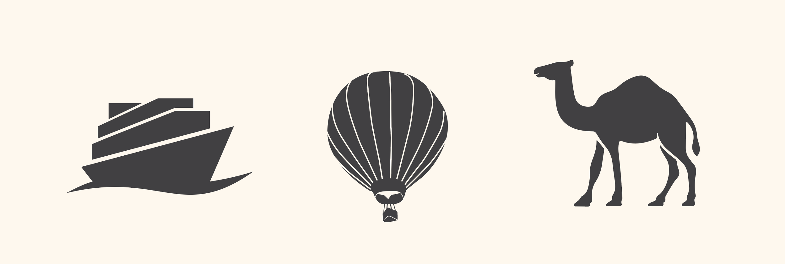
Since the idea of “circumference” at the magazine’s inception was intended to reference traversing the globe to proliferate and spread art, we use a different colophon for each issue, all based on modes of transportation. These serve as markers for poems without titles or as section breaks in poem excerpts or long prose where a contributor preferred a more stylistic option than simple asterisks.
colophon images from different issues
To further get at the notion of “circumference” without explicitly using a circle, the marginalia touch all four edges of the interior spreads, forcing the reader to track the entire book’s perimeter. The titles appear duplicated on the sides of the spread where the reader would hold the book with their thumbs, allowing them to be covered for distraction-free reading, but also to serve as another wayfinding point when flipping through the book.

